Does the image function as effective retail ad, instant readability of the hero subjects, strong contrast, clean hierarchy, and brand-appropriate?

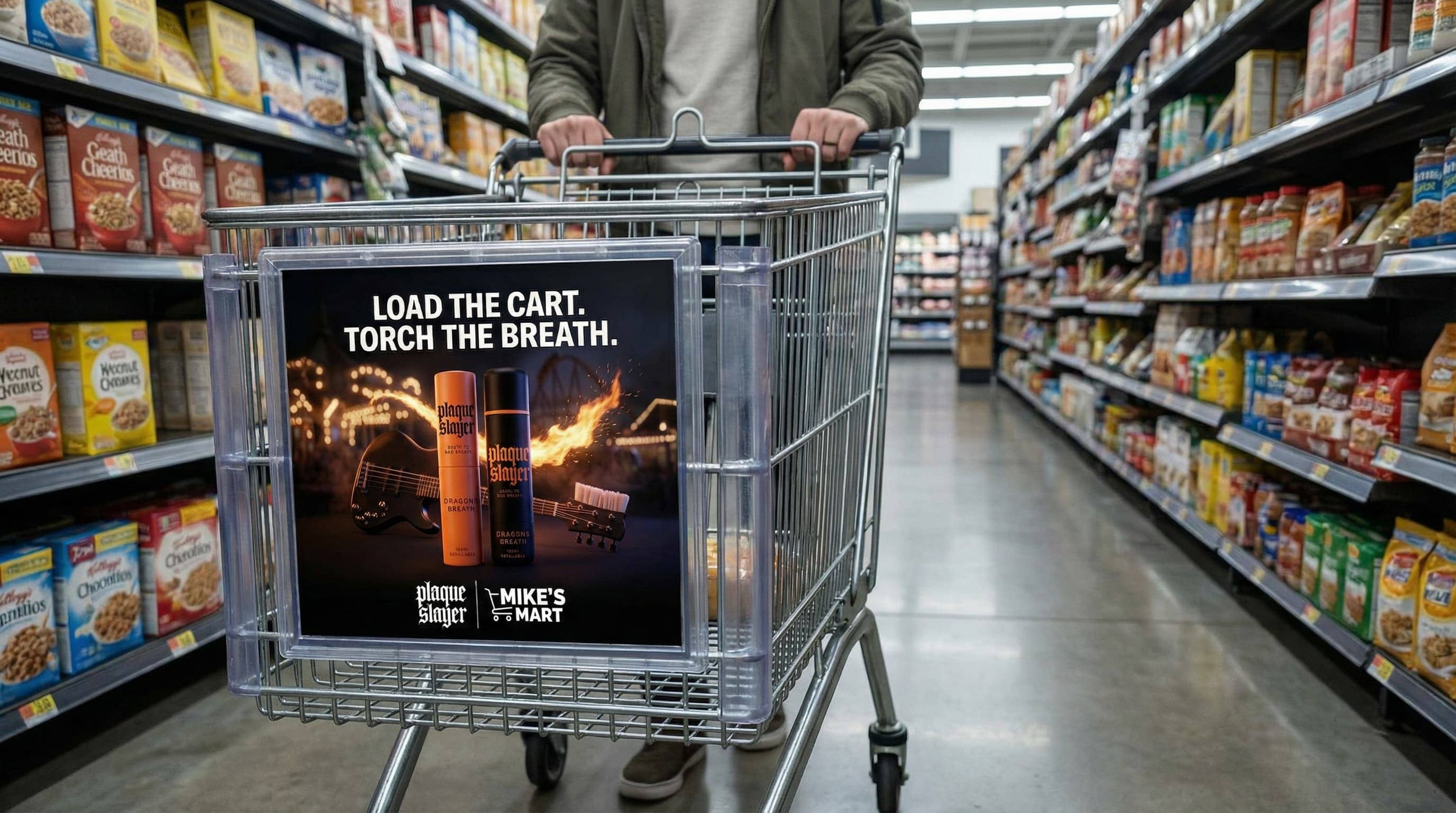
This test case passes. The output functions as a high-fidelity retail advertisement by convincingly integrating the shopping-cart panel ad into a supermarket aisle scene with accurate perspective and a realistic mounting frame. The design successfully adheres to the Plaque Slayer brand style, featuring both the Dragon’s Breath mouth spray and toothpaste as clear, legible hero subjects. The high-contrast headline is readable at a glance, ensuring the ad meets the primary requirement for instant in-aisle impact and retail readiness. The output is suitable for real-world use without manual correction, as it provides a professional, technically sound, and brand-appropriate execution of the creative brief.
Red: Not supported; Green: Supported
Primary deliverable: Digital signage video loop (MP4)
• Resolution: 1920×1080 (landscape) or 1080×1920 (portrait) per placement
• Codec: H.264, High Profile; 8–12 Mbps; AAC audio 48kHz (or muted for silent venues)
• Duration: 6–15s loop; seamless loop; no fades unless requested
Create a print-ready 2K 1:1 shopping-cart front-panel ad for Plaque Slayer “Dragon’s Breath” aimed at older teens (18–20). The ad artwork must feel like it belongs to the Dragon’s Breath campaign world: a cinematic nighttime carnival/rollercoaster vibe with deep blacks, high contrast, and controlled warm ember/orange accents. For the background, a subtle haze and soft bokeh carnival bulbs with a faint rollercoaster structure silhouette. Add a refined “dragon breath” flame-and-spark trail that sweeps behind the products like a rollercoaster drop path (contained and clean, not chaotic; nothing else is on fire). Place both provided packshots (mouth spray + toothpaste) upright side-by-side as the heroes, perfectly sharp and fully legible, lit like premium low-key studio photography but with warm firelight accents and cool shadow fill to match the background. The product lighting needs to match the scene. Add King Bristle’s guitar-toothbrush weapon as a background prop element: position it laid diagonally behind the two products (partially obscured by them, but still clearly identifiable), and ensure the toothbrush-head side is visibly readable as a toothbrush (bristles clearly visible, not mistaken for a normal guitar). Keep it slightly behind the products so it supports the composition without competing; it should feel physically present in the same scene with matching perspective, depth-of-field, and lighting, with subtle ember highlights consistent with the flame trail. Headline in CONDENSED BOLD uppercase: “LOAD THE CART. TORCH THE BREATH.” large, high-contrast, and readable from distance, placed in clear negative space without covering products. Include the Plaque Slayer logo (provided) plus a simple “Mike’s Mart” logo you create: clean wordmark “MIKE’S MART” in bold geometric sans with a minimal cart-outline or price-tag icon, monochrome/white; present as a partnership lockup near the bottom. No extra copy, no clutter, print-ready.