"Does the character design and style consistent with other brand's characters?"

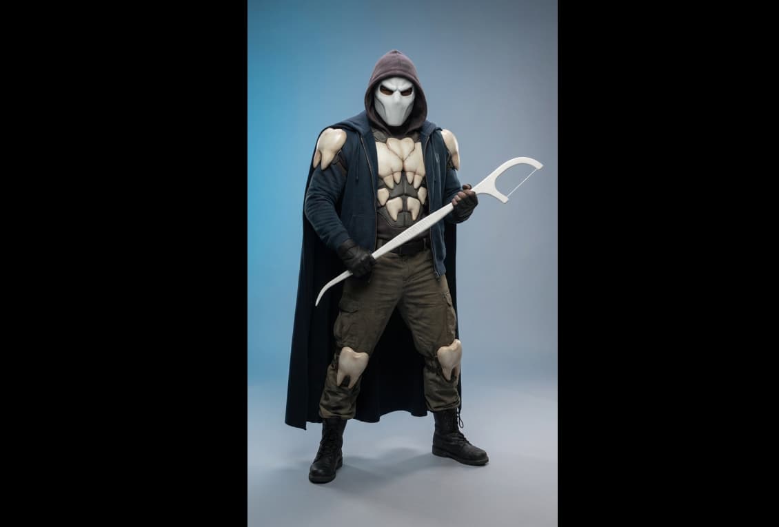
This test case passes because the side-kick character design demonstrates exceptional consistency with the established brand identity. The character successfully expands the mascot universe by applying the logical progression from a toothbrush (King Bristle) to a dental floss companion, ensuring immediate recognition and narrative cohesion. Visually, the illustration maintains high fidelity to the brand’s aesthetic through its gritty, 3D-modeled appearance and bold stylistic choices that align with the original characters. Because the output is fully realized and requires no manual correction, it is entirely suitable for real-world use in professional marketing materials and brand storytelling.
Red: Not supported; Green: Supported
Primary deliverable: Vector master (AI/SVG/PDF)
• Vector: CMYK + RGB versions; outlined fonts; strokes expanded where needed
• PNG exports: 24-bit, transparent background; 1×/2× sizes for digital
Create a new “Plaque Slayer” dental-care themed mascot monster for young working adults: a bold, scary monster/creature or hero with a confident stance and expressive face (slightly intimidating), rendered with a realistic adult-oriented look featuring grounded proportions, smaller non-exaggerated eyes, believable facial anatomy, and high-end practical-costume realism with premium materials, visible stitching, textured skin, and subtle imperfections; use crisp studio/product lighting with clean shadows and strong subject separation, dress the mascot in modern streetwear-meets-workwear with tasteful vibrant accents and an edgy vibe, place it on a seamless studio color-drop cyclorama background with a smooth gradient and soft floor shadow (minimal, ad-ready), compose as a full-body centered shot with ample headroom and product-ready negative space. Make sure the character is dental themed. The aspect ratio should be 9x16. - Give me 3 options