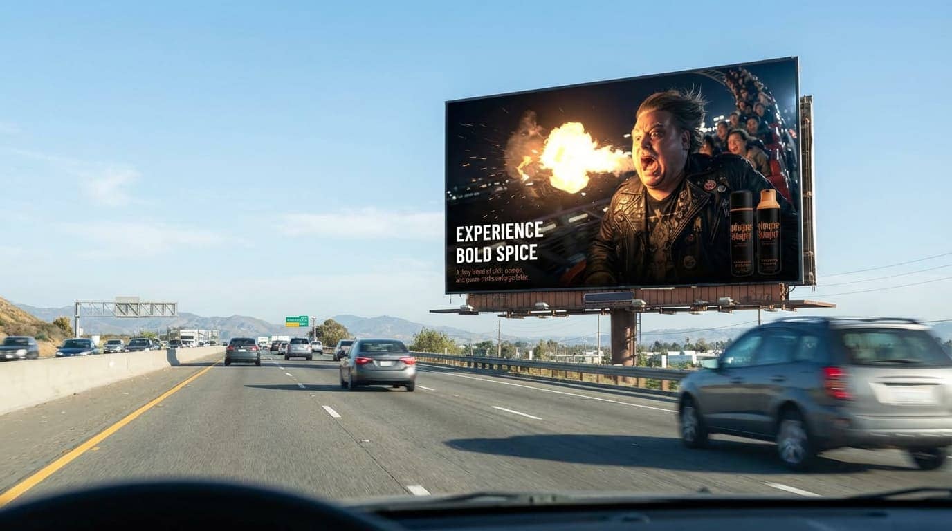
"Does the mock-up seemlessly integrated into the environment well?"

This test case passes as the ad mockup demonstrates successful surface integration, accurate perspective, and proper aspect ratio fitting on the billboard placement. The primary messaging remains clearly legible, ensuring the core intent of the creative is effectively communicated. There is room for improvement regarding the environmental lighting alignment relative to the sun's position and the sharpness of small-scale typography, which could be further refined with more specific environmental prompting. Despite these technical limitations, the output is suitable for real-world use as a professional presentation mockup because the overall structural fidelity and placement read naturally enough to be used in a client setting.
Red: Not supported; Green: Supported
Primary deliverable: High-res image master (TIFF)
• Master: 16-bit TIFF, Adobe RGB; non-destructive retouching; layered PSD as source
• Web: sRGB JPG (quality 80–90) or PNG for transparency; 2000px long edge unless specified
• Crops: provide common aspect ratios (1:1, 4:5, 16:9, 9:16) with safe copy area
Create a mockup of the 16x9 version where it is placed on a 16x9 highway billboard at daylight. Make sure the mockup and billboard looks realistic, and that the highway is visible. Correctly viewing the billboard from the correct approaching cars angle. Perfect for a design team specialized in mockups and advertising for concepting.