"Does the output deliver brand-aligned internal communication visuals that clearly convey the message, fit internal channels (email, intranet, chat), and provide at least two creative variations?"

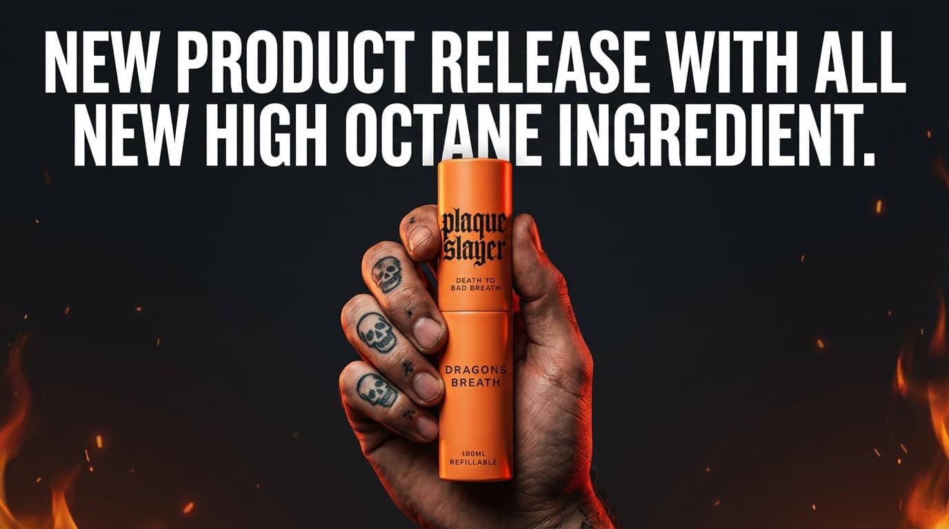
This test case passes. The output provides high-fidelity, email-safe visuals with mobile-readable typography and a clean, uncluttered layout that ensures the hero product remains the central focus. While there is room for improvement regarding product sizing to more closely align with real-world dimensions, the overall execution maintains the requested dramatic tone and visual consistency. The output is suitable for immediate real-world use in internal communication channels, as the clarity of the messaging and the professional composition require no manual correction.
Red: Not supported; Green: Supported
Primary deliverable: High-res image master (TIFF)
• Master: 16-bit TIFF, Adobe RGB; non-destructive retouching; layered PSD as source
• Web: sRGB JPG (quality 80–90) or PNG for transparency; 2000px long edge unless specified
• Crops: provide common aspect ratios (1:1, 4:5, 16:9, 9:16) with safe copy area
Create a 16:9 email banner for the Dragon’s Breath launch. A single hand centered in the frame holding the provided Dragon’s Breath mouth spray upright towards the camera; the product name must be clearly visible and legible. The hand should be lit like a premium studio product shot with dramatic side/top lighting, strong contrast, and visible skin texture, and it should feature bold black skull tattoos on the fingers similar to classic flash-style ink (clean, high-detail, not messy), with realistic knuckle creases and slight grime/texture for grit. Background is clean and uncluttered (deep charcoal/black gradient with subtle texture). Lighting is dramatic and slightly high-contrast with controlled warm red/orange highlights to suggest heat/intensity, keep flame cues refined and minimal (soft ember glow or small controlled flame accent) and never cover the label. Add headline text: “New Product Release with All New High Octane Ingredient.” in CONDENSED BOLD uppercase, large, in white color and mobile-readable. Keep generous padding so it reads well in email. No extra logos, no clutter, polished internal comms style.